Interactive Trade and Tariff Charts
Interactive visualisations that provide insight into trade data and tariff rates
Note: These charts are currently optimised for desktop viewing. Mobile-friendly versions are under development.
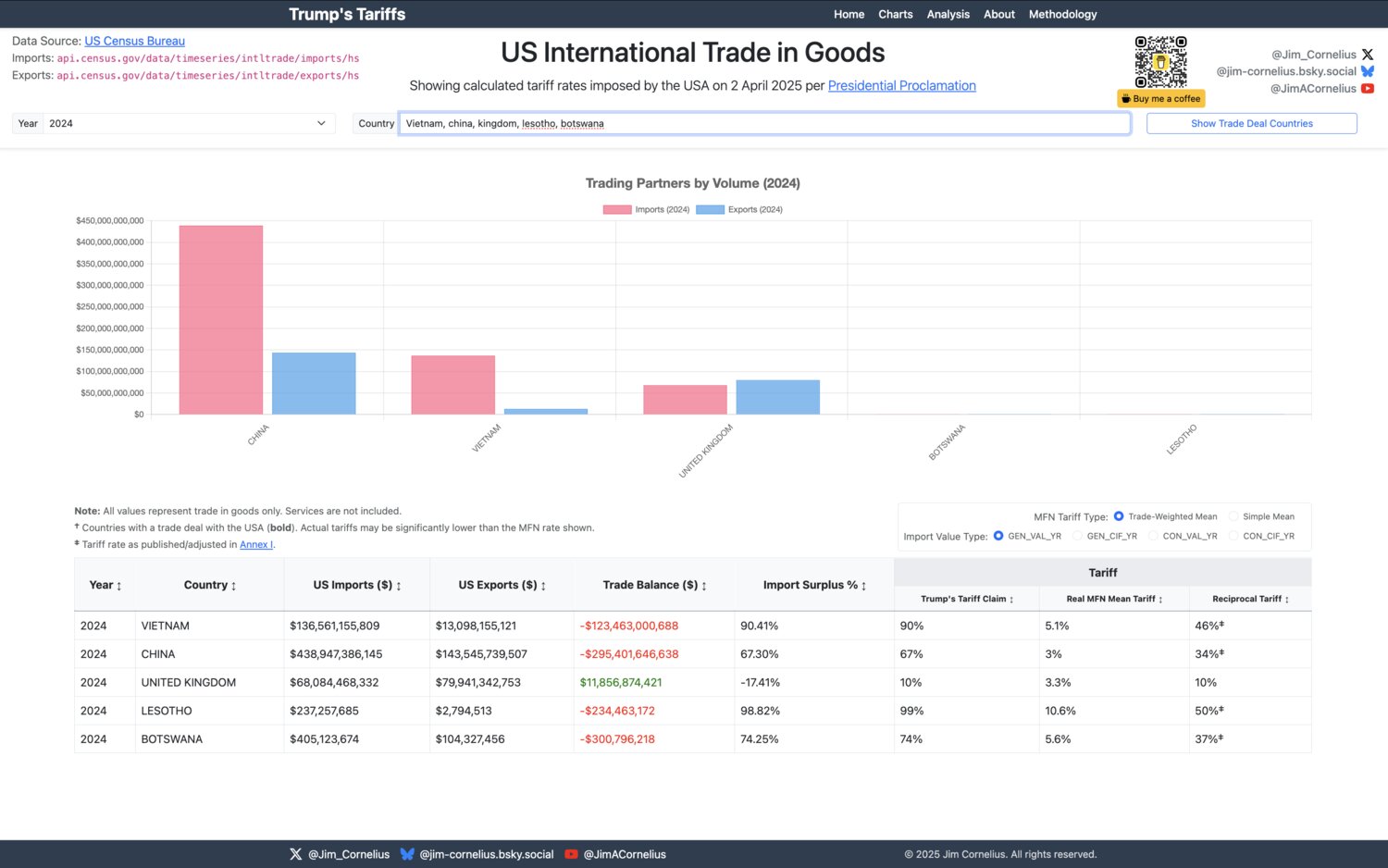
Trade Balance Analysis
This chart illustrates how the new US tariffs were calculated based on trade balance data. You can compare tariff rates across different countries and see the discrepancy between the tariffs claimed to represent each nation versus the actual mean tariff rates calculated by the WTO. Future enhancements will allow comparison across different economic sectors.
 View Chart →
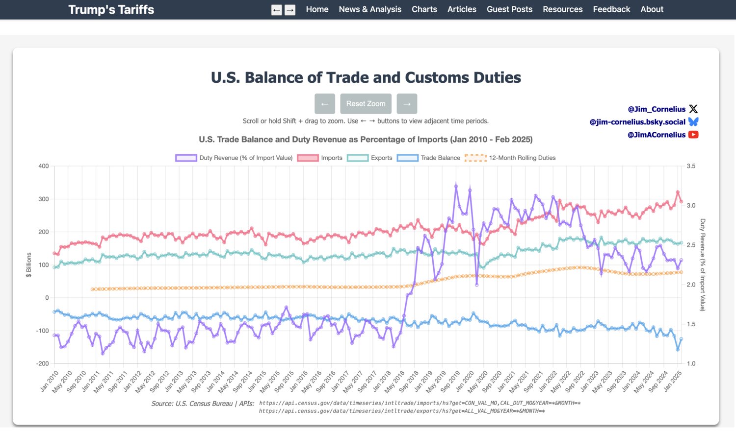
Exports, Imports and Duties
This chart presents monthly data from the US Customs Bureau showing the latest figures on imports, exports, and duties collected. You can explore how much duty has been raised on specific import sectors and track changes over time. The visualization helps understand the relationship between trade flows and tariff revenue.
 View Chart →